To better understand use-cases and possibilities of visualisations with Sankey Diagrams, this page has some different examples of data that can be visualized with Sankey Diagrams / Sankey Charts.
See How To Create a Sankey Diagram to unlock the potential and storytell with your data by creating easy to understand Sankey-Visualisations, making your complex data more accessible and engaging.
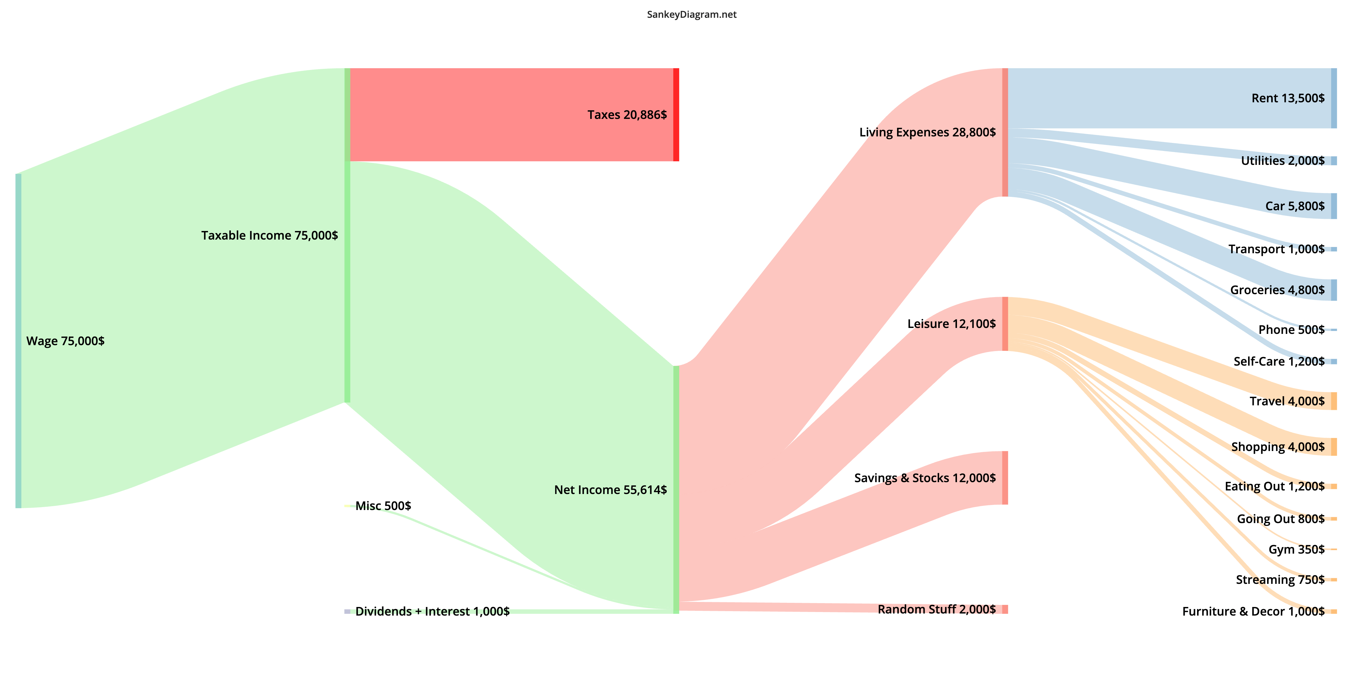
Example Personal-Finance Income Budget Sankey Diagram
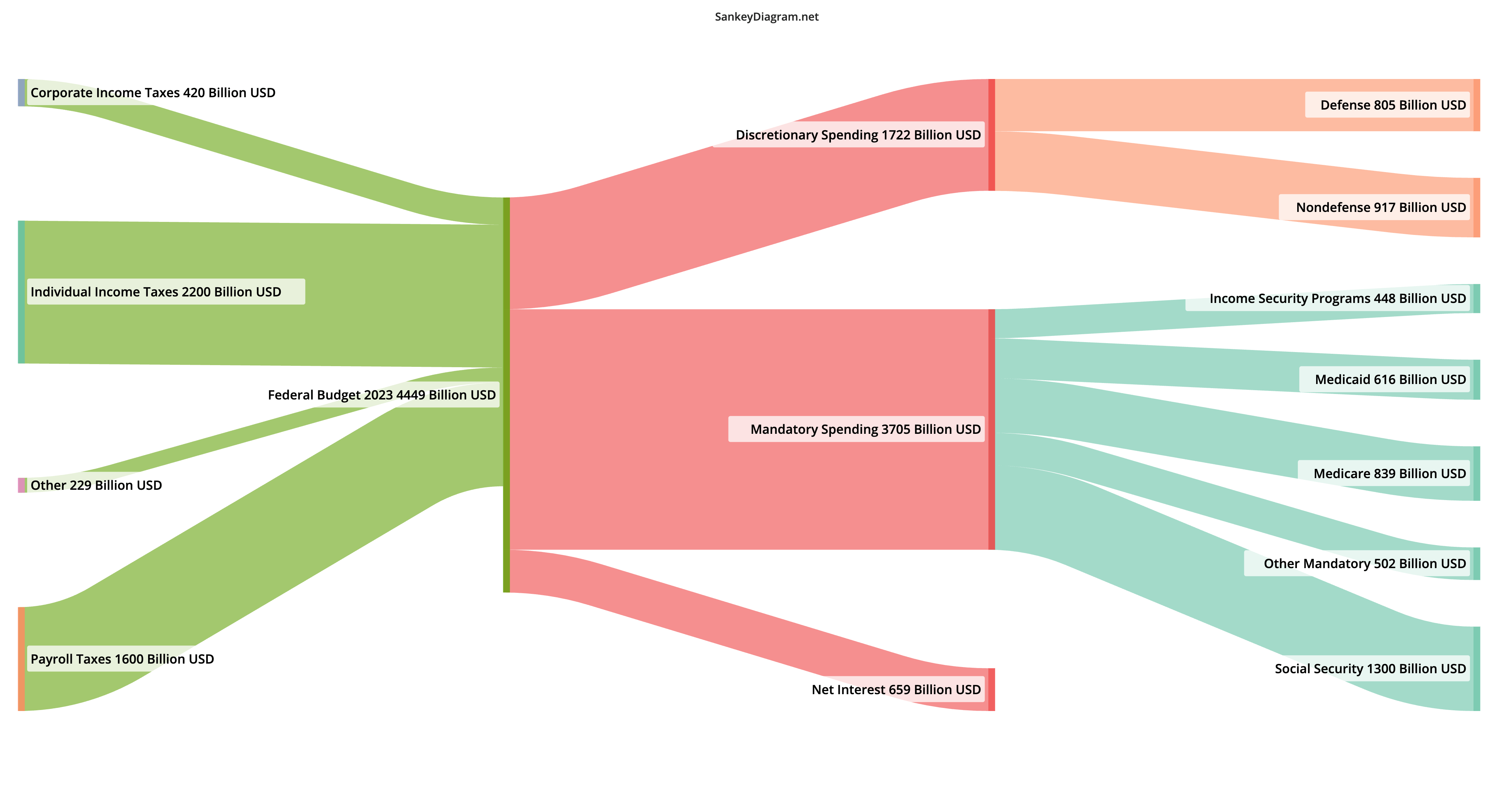
This sankey plot shows the United States of America's federal budget in fiscal year 2023. The example has customizations like custom flow colors, custom font size, and activated node-label background. The raw data is taken from Wikipedia/Congressional Budget Office: "Government spending in the United States".
 View Diagram Source: Edit This Diagram